CASE 02 · LIVE PRODUCT · 2025–2026
ehlisunnah.com
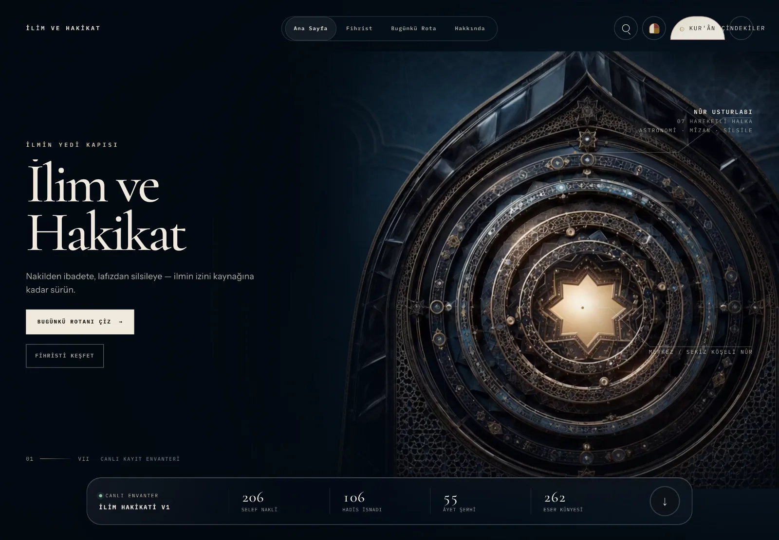
A Turkish Islamic-studies platform. Not a blog — a body of interactive modules spread across 189 routes, held together by one design language.
02 — THE PROBLEM
Make it navigable
without flattening it.
The content is both deep and heavily cross-linked: scholars, works, narrations, concepts, practice. A conventional menu either flattened it or drowned the reader.
The decision: move navigation into a spatial metaphor. Seven gates, rooms beneath them; a module earns its own screen to the extent it is genuinely different.
03 — APPROACH
System first,
then pages.
Colour, type and spacing defined as tokens in one place; five atmospheres built on top of them.
Every module started with a brief; no code before discovery and plan were signed off.
Content bound to schemas; a record without a source citation fails the build.
Each module accepted by measurement — screenshot and number, not "looks fine to me".
04 — DESIGN SYSTEM
Five atmospheres,
one language.
Paper & Ink, Navy Night, Emerald Silence, Rose Ash and Observatory. The reader chooses; all 189 routes draw from the same token set.
06 — GENERATIVE ENGINE
Same input,
same artwork. Always.
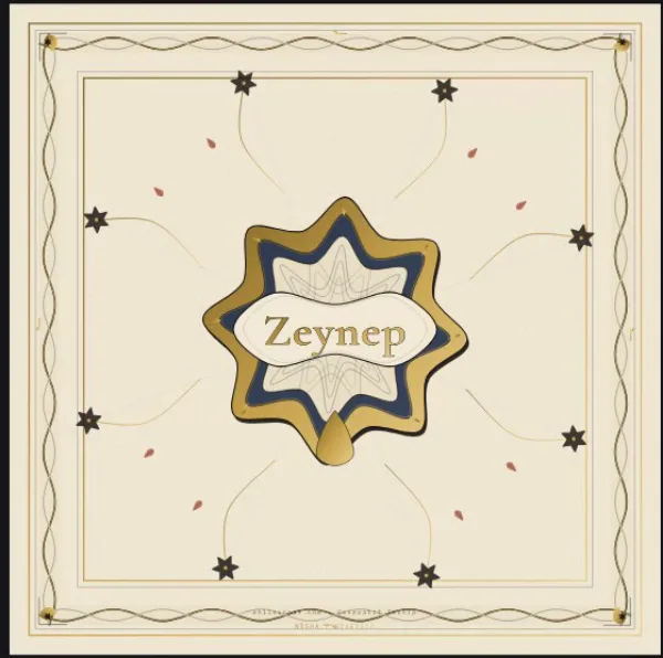
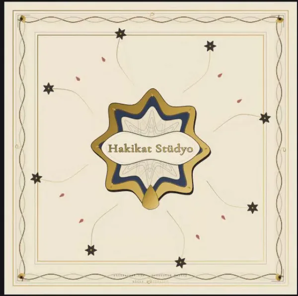
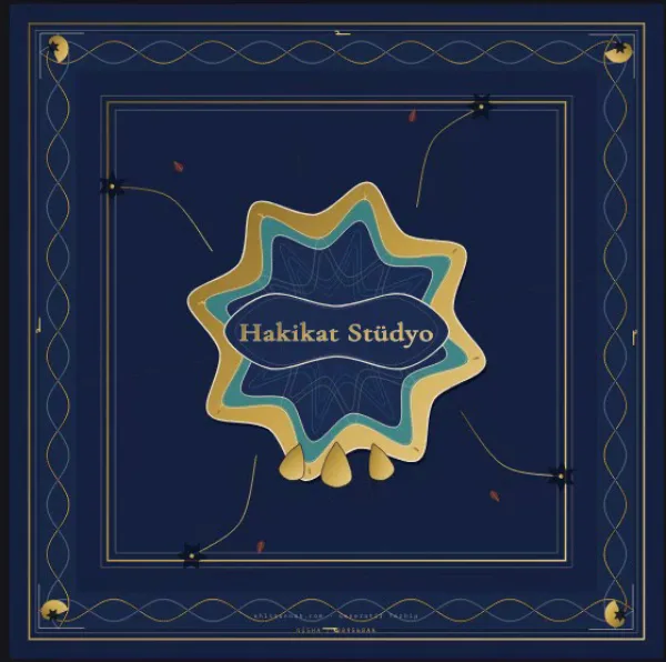
The reader types a name and picks mood, palette and composition. The engine draws a vector illumination plate in the browser — redrawn on every keystroke.
The engine is deliberately pure and deterministic: no network, storage, clock or DOM input. Identical text and choices always yield the identical plate — which makes the output testable, exportable and sharp independent of device pixel ratio.
08 — DATA VISUALISATION
109 nodes,
eight branches.
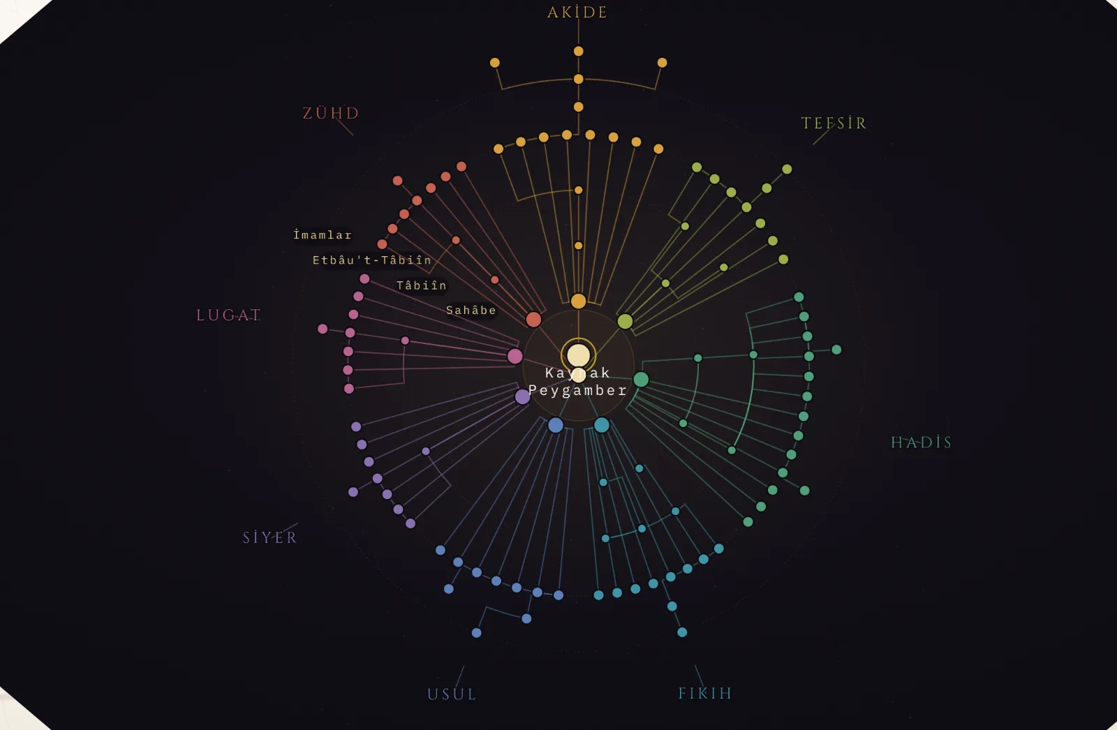
The source sits at the centre; eight disciplines occupy sectors, generations occupy rings. The polar layout is drawn in hand-authored SVG — each node's angle and radius computed from the data.
Why not an off-the-shelf graph library: what must be read here isn't an arbitrary network, it's generational order. A radial layout gives that at a glance; force-directed layout did not.
09 — ASTROLABE
A working instrument,
not an ornament.
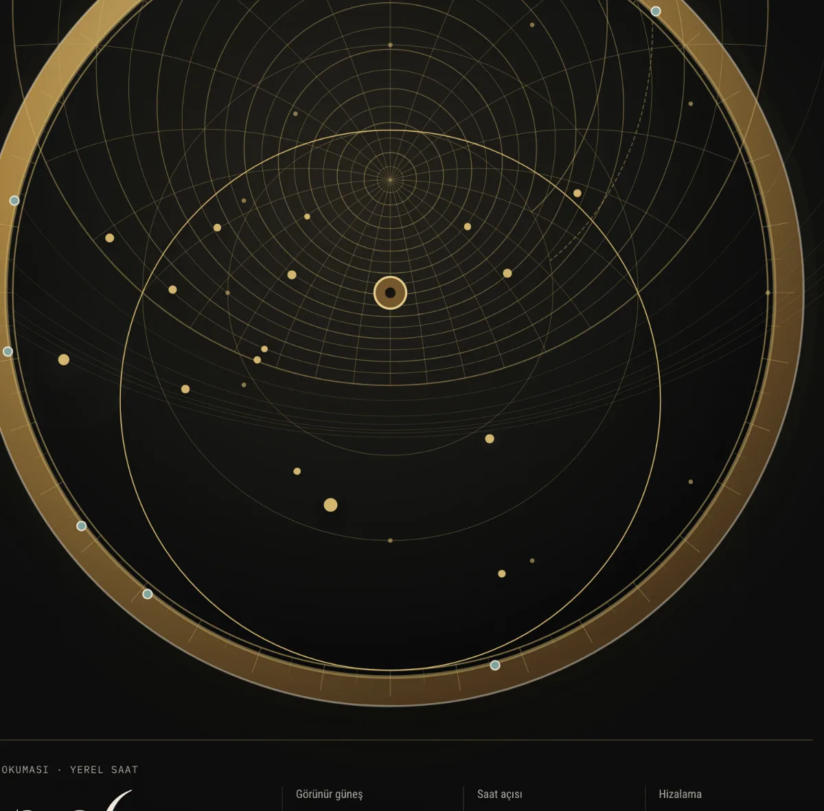
Rotate the rete, read the time, inspect the qibla direction. Everything is computed on-device; it does not call an external time or location service.
Plate and rete are drawn as SVG; the drag controller and the determinism of the drawing have their own unit tests.
10 — RESPONSIVE
Mobile is rebuilt,
not shrunk.
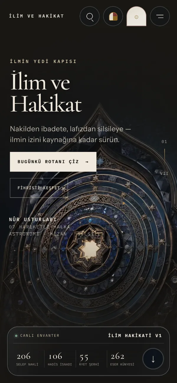
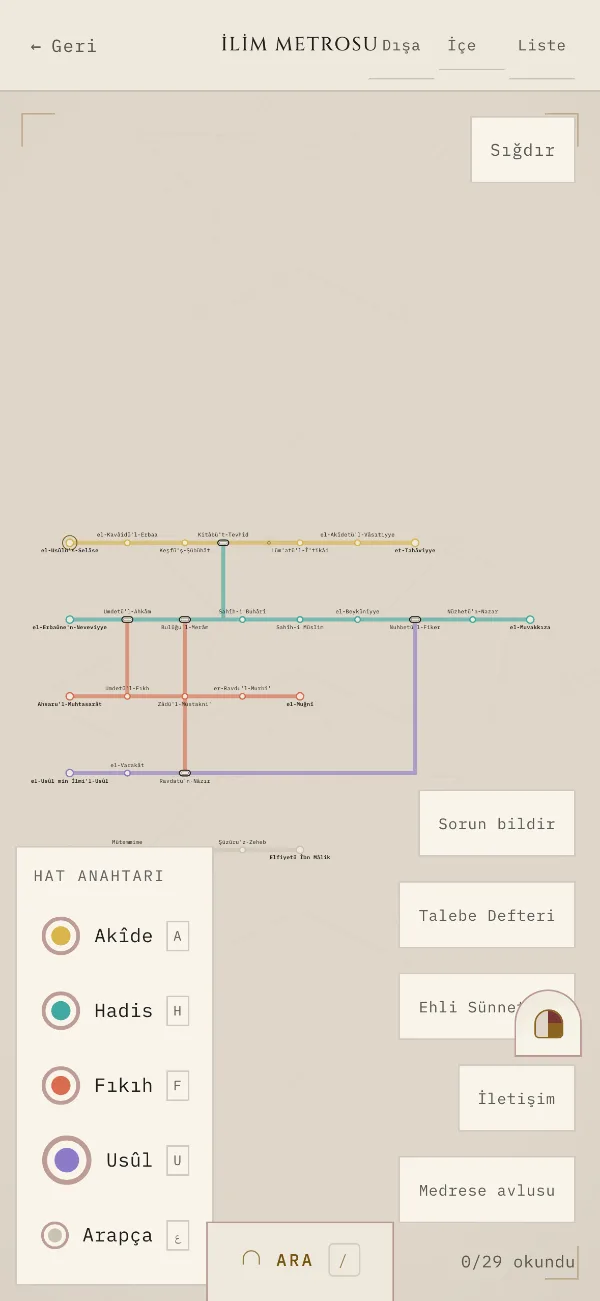
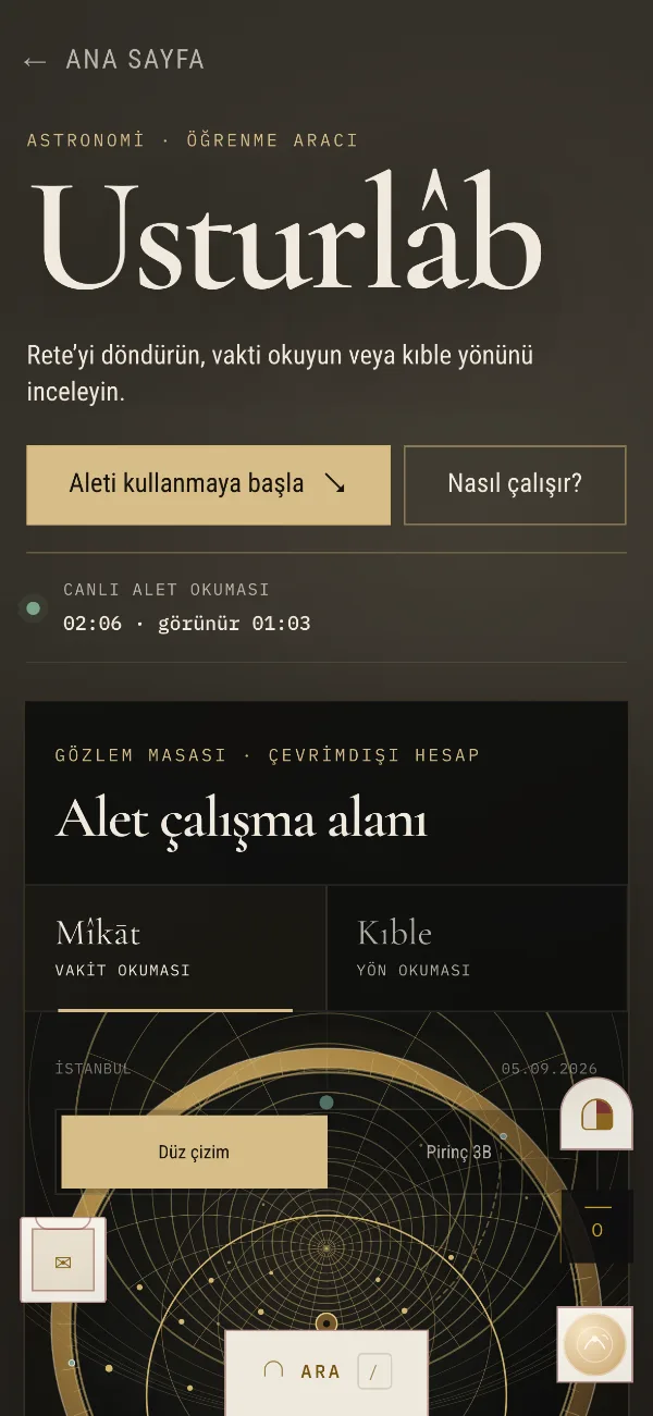
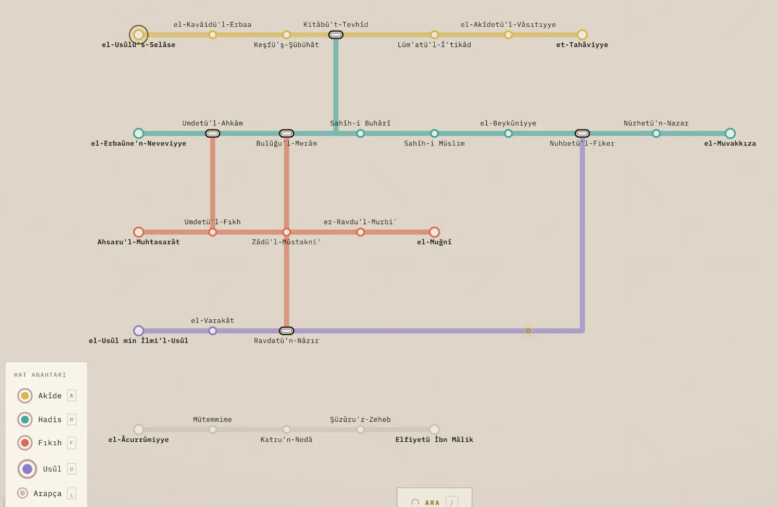
Designed from 320 to 1920px. The top bar collapses to an icon row, the hero restacks, the transit map reflows.
11 — TECHNICAL
As measured.
| Framework | Next.js 16 (App Router) · React 19 · TypeScript |
| Styling | Tailwind v4 · CSS Modules · styled-jsx |
| Motion | framer-motion · GSAP (ScrollTrigger) · Lenis |
| Graphics | Hand-authored SVG · Three.js / R3F (one live scene) |
| Data | File-based content · Zod schema validation |
| Scale | 189 page.tsx · 873 components |
| Tests | 2,080 (2,077 passing) · Vitest + Playwright |
| Type safety | tsc --noEmit clean |
| SEO | 45 dynamic OG cards · JSON-LD in 76 files |
| Delivery | Vercel |
12 — QUALITY & ITERATION
Gates at build time.
More than 40 content validators run in a chain before the build. A record missing its source does not ship — content accuracy is a build condition, not a preference.
On the interface side acceptance is measured: screenshots, pixel measurement, overflow checks. This portfolio was produced the same way — a navigation collision measured across 13 viewport widths was found and fixed exactly like this.
I work with an AI-assisted development workflow. Direction, design decisions, acceptance criteria and quality control are mine.